
NAV CANADA launches new logo and corporate branding
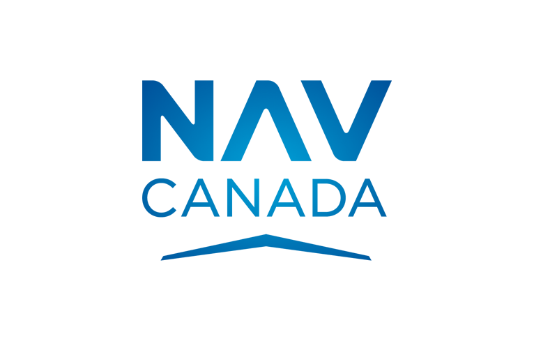
NAV CANADA, the country’s air navigation service provider, introduced today the Company’s new logo and corporate branding. This rebranding reflects the Company’s growth, as well as its renewed vision for the future.
The Company’s 4800 employees have helped NAV CANADA earn its well-deserved global reputation for safety, technology innovation and service delivery.
“With two decades of exceptional service behind us, we have matured as a company,” said Neil Wilson, President and CEO. “It’s an exciting time to be an employee of NAV CANADA as we are among the leaders of some of the most revolutionary advancements in air navigation. Our new branding and logo reflects our passion to be best in class.”
The new NAV CANADA logo is an evolution of the original signature, using modern, vibrant blue to reflect the hues in the sky and radiating a sense of innovation, inspiration, and trust. An updated version of the wing offers a sense of advancement, and doubles as a design element. The colour palette contains hues found in our operational environment and the new typefaces offer a clean, welcoming look.
In addition, the NAV CANADA Blog is also being launched today, replacing Direct Route, the Company’s customer newsletter. The Blog will cover topics about aviation safety, ATM innovation, environmental initiatives and the people of NAV CANADA. You can read the first edition of the Blog here blog.navcanada.ca/

.png)


Comments
There are no comments yet for this item
Join the discussion